


Hate crimes and Inequality
The US has just experienced the highest levels of hate crimes ever.

The last article for American Inequality was featured as an op-ed in the Lexington Herald. You can read the article and view the video that they produced for the piece here.
Hate is on the rise in America.
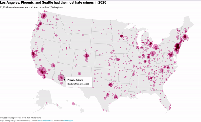
11,126 individuals were the victims of hate crimes in 2020, the highest ever on record. According to new data from the FBI released last month, more than 8,263 hate crimes occurred last year that violated minority communities across the the country.
Los Angeles saw the most hate crimes of any city in America. More than 1 hate crime occurred in LA every day single day of 2020. Once every 3 days, a hate crime was committed against a Black person in LA. Once every week, a hate crime was committed against a Latinx person in LA.

32% of all hate crimes are motivated by hate against race/ethnicity/ancestry, the highest of the 6 categories. This category saw a 32% increase in hate crimes, increasing from 3,963 hate crimes in 2019 to 5,227 hate crimes in 2020. The the lowest percentage of hate crimes are motivated by gender at 0.7%.
How’d we get here?
Hate crimes cover 6 main categories — (1) Religion, (2) gender, (3) gender identity, (4) disability, (5) sexual orientation, and (6) a catch-all category called ‘race/ethnicity/ancestry’.
Hate crimes were first established as a legal concept in the US in 1968 with the passage of the Civil Rights Act. Title I stipulated that any person who “willfully injures, intimidates or interferes with… any person because of his race, color, religion or national origin” was subject to federal prosecution. The Act went largely unchanged for 30 years until the passage of the Violence Against Women Act, which permitted prosecution against gender-motivated hate crimes.
It would take another 15 years before President Obama was able to pass the Matthew Shepard and James Byrd, Jr. Hate Crimes Prevention Act, which included perceived gender, sexual orientation, gender identity, or disability as a category of hate crimes. This bill only passed because it was attached to the National Defense Authorization Act for fiscal year 2010.

Hate crimes have existed well before they were codified into law. For centuries, hate crimes have been highest against Black Americans, and 2020 was no exception. 2,871 people were were victims of anti-Black hate crimes last year. 56% of the race-based category for hate crimes being motivated by anti-Black bias.
What is a hate crime?
Although LA’s hate crimes are remarkably high, at least we have data here. One of the biggest challenges of analyzing this problem is hate crimes often go unreported.
For example, the Houston Police Department, which serves 2.3M people, only reported 8 hate crimes in 2017. For this to be true, it would mean there would have to be only 1 hate crime for every 292,000 people. Similarly, the Miami-Dade Police Department, which serves 1.2M people, only reported 1 hate crime that same year.
Reporting isn’t only a challenge of accuracy, it can also be a challenge of how much of the state is actually covered. For example, Mississippi was the state with the worst reporting coverage in 2020. 92 agencies report hate crimes in the state, but those agencies only serve 43% of the population, which means we have no idea if 1.6M Mississippians experienced any hate crimes in Mississippi
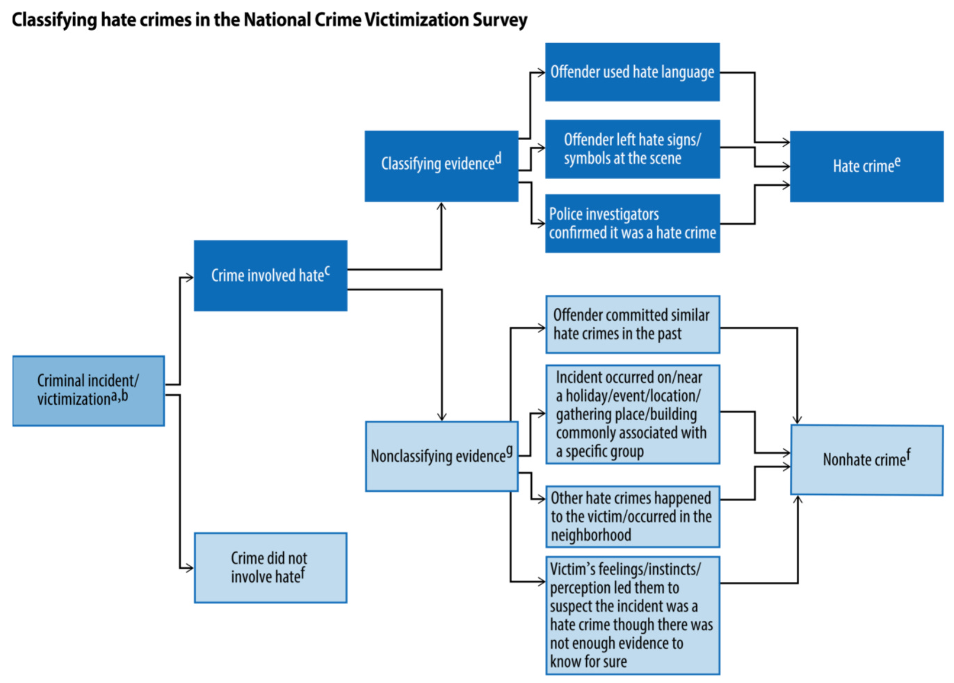
Victims can often struggle to prove that a crime was actually a hate-crime. The Bureau of Justice uses this flow chart above from the Hate Crime Statistics Act to make this determination. The Act, passed in 1990 and modified in 2009, defines hate crimes as “crimes that manifest evidence of prejudice based on race, gender or gender identity, religion, disability, sexual orientation, or ethnicity.”
Hate language in general can also be difficult to pinpoint, as many Asian Americans experienced in the prior year. President Donald Trump often used the brazenly racist phrase “Kung Flu” to refer to the COVID-19 virus, but this may not be considered hate language in an attack. Although the FBI counted 279 anti-Asian hate crimes, Stop AAPI Hate documented 6,603 hate incidents last year. Leaders of the group say the true number may be much higher, and the data has continued to prove this out.
The Path Forward
We need to reverse the trend on hate crimes that has been rising steadily since 2008. We need to pass laws, invest in communities, and take care of each other. While some of these path-forward-proposals will increase the number of hate crimes that we count, it will allow America to protect those most in need.
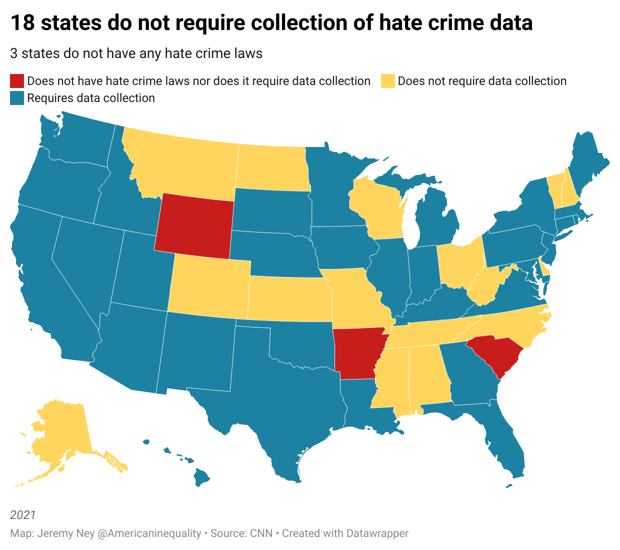
Pass state legislation to require hate crime reporting — Only 18 states do not have a legal requirements to report hate crime data to the FBI. As such, data collection is voluntary in those areas. The Department of Justice currently relies on reports from 15,138 state and local agencies to report hate crimes, but much of this is voluntary. Wyoming, Arkansas, and South Carolina don’t even have any local laws explaining what hate crimes are and are not.
Huntsville, Alabama has no requirement to report hate crime, and police Captain Dewayne McCarver, takes this to heart. He cautions students in the academy to be “very careful” in classifying offenses as possible hate crimes when writing up incident reports. He told ProPublica that officers in Huntsville “rarely, if ever” designate offenses as hate crimes.
“It’s really a box that I personally wish they didn’t put on a case report,” he said. The Huntsville Police Department had never reported a hate crime to the federal government until 2020.
Train police offices in identifying hate crimes — Only 12 states have statutes requiring that academies provide instruction on hate crimes. Hate crimes are not simple to deal with — motive is everything in the trial process and it is critical to not mishandle information on what was said. Federal Law Enforcement Training Centers across America have a budget of $355M, more of which should be spent on engaging departments that they have not yet contacted and providing more training on how to report hate crimes.
Improve the ways we characterize hate crimes—The Anti-Defamation League keeps a list of 214 words and symbols that can be used to characterize hate. Some minorities are better represented here than others, but we can do more to make sure we are capturing the full range of hateful terms that can be used in a courtroom to show intent.
Take care of your neighbor—1 in 3 hate crimes occurs in public. Victims surrounded by bystanders are often attacked. The national discourse has been painful for the last 4 years and we cannot ignore how the rhetoric has changed. Know that hate crimes are on the rise and minority communities may be feeling particularly vulnerable. The next time a hate crime happens, text a friend and make sure they’re ok. Whether you’re in a protected category or not, love is the best weapon against hate.

Gary Bravo was leaving a gay bar in downtown Huntsville, Alabama. As he walked out with two co-workers, they encountered a group of young men who attacked him and shouted homophobic slurs at him.
“A couple more hits and I would have ended up being brain dead,” Gary recalled.
Gary suffered extensive injuries from the attack and his eye socket had to be reconstructed. Despite his attackers’ words during the beating, police did not investigate the assault as a hate crime, nor did they report it to state or federal authorities as motivated by hate. 6 years later and he still has gotten no further. The state of Alabama, with a population of nearly 5M people, reported only 10 hate crimes that year.
You mention this at several points, but that map to me looks 100% skewed towards "where are hate crimes recorded" and "where are hate crimes reported". Meaning, some places that seem to be low incidences of hate crimes are because neither is true: not recorded and thus not reported. There's an odd sense in which the visible clusters on the map are signs of *health*, not signs of trouble: places where there's recording and where thus there's reporting.